Ranking Pitt’s football uniform rotation
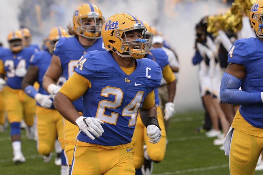
James Conner runs onto the field during the 2016 homecoming game.
September 25, 2020
Pitt football unveiled an alternate uniform Monday that players will wear Saturday against Louisville. That gives them three total uniform combinations — the perfect amount for football in my eyes — and here’s how I think those three uniforms stack up from worst to first.
- Steel Gray Alternates
Unfortunately I have to put the steel gray uniforms here. Pitt crafted this uniform as homage to Pittsburgh’s history of steelmaking, which also inspired the Pittsburgh Steelers’ name. It makes sense that the Panthers would do something similar.
The uniform is packed with meaning, as every little detail has a well-thought-out backstory. Alas, meaning doesn’t matter when you’re watching football, and I’m not here to regurgitate the Nike video explaining every little detail. The uniform does a lot right, but it also does some things wrong.
The helmet is amazing. The designers beautifully integrated the new Panther logo with the solid steel color — no stripe down the middle — which wouldn’t have worked on Pitt’s other uniforms. The lighter gray numbers contrast well with the darker gray jersey, and the small spots of gold — which represent molten steel — look nice.
The name on the back and everything on the shoulders — numbers, H2P insignia and “P” of Pitt — are all black, however, and aren’t as nice to look at. Granted, the shoulder adornments are reflective, but the name is not. Black on black does not work well — see Miami Marlins black jerseys — and it can be hard to see those little details packed with meaning. But to make all those details gray would be too much, and also very similar to the Las Vegas Raiders.
The designers put a little too much on a uniform that doesn’t need it, which a simple color change can’t fix. It’s a good uniform, but the worst of the three.
- Blue Jersey / Yellow Pants
The middle spot goes to the traditional home uniform — the blue jersey, yellow pants and yellow helmet. Unveiled last year as part of a program-wide rebrand, these uniforms updated the classic blue-and-yellow color scheme of the ’70s, ’80s and half of the ’90s. This was a fantastic decision after the school experimented with navy blue and gold, akin to Notre Dame or Georgia Tech. Those colors didn’t work for Pitt, and the school ultimately retired them, saying they weren’t coming back.
The football uniforms gave a new take on a classic design. Away went the typical varsity number font, and in came a new custom font that’s more rounded and unique. The yellow helmet’s simple design gets the job done — extra points for the stripe — and the jersey swaps out the white numbers of the past with yellow ones. I think that blends the whole look nicely, and it’s generally a pleasing uniform to look at — except on the field.
Seeing the blue and yellow on a green field looks oversaturated. Watching the game against Syracuse, it felt like the players were drawn into the game with oil pastels. The blue uniforms are clean, but perhaps too clean.
- White Jersey / Yellow Pants
This leaves the white jersey, yellow pants and yellow helmet combination. It’s exactly like the blue uniform, except for the jersey. I have the exact same reasons for liking this uniform set as I do for the blue uniform set. It’s simple, the colors mesh nicely and it was all part of a bigger rebrand that was an overall success. If we just looked at the uniforms by themselves, I would put the home and away uniforms on the same level.
However, the one deciding factor is that the white uniforms look much better on the field than the blue ones do. Perhaps it looks more rugged than the blue — or maybe I like the blue numbers more than the yellow numbers. Either way, I’m always excited to see them wear the road whites.
Pitt football has a great selection of uniforms — they stand up there with some of the best uniforms in the ACC. These rankings could change after we’ve seen the steel gray uniforms in play, but this is where they stand for now.


