
Hinton: Pepsi ‘Breathless’ over new logo
February 19, 2009
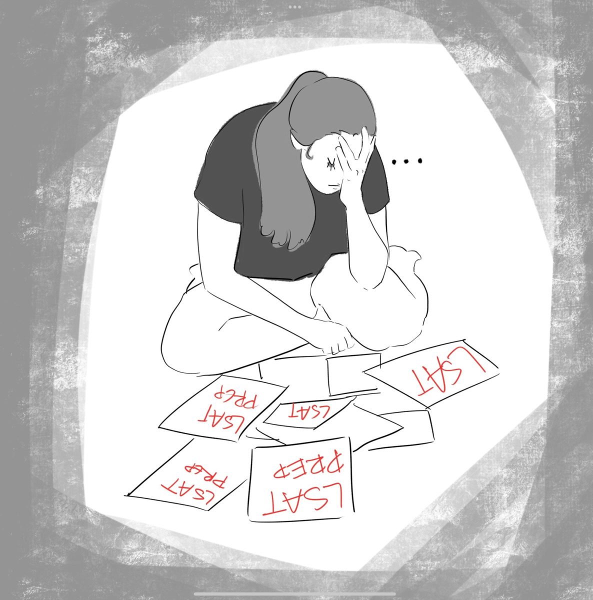
It is likely that PepsiCo has gone crazy. Last week, Gawker.com led a massive Internet leak of… It is likely that PepsiCo has gone crazy. Last week, Gawker.com led a massive Internet leak of the purported strategy behind Pepsi’s October logo redesign. The document is alleged to have come from Arnell Group, the company that PepsiCo paid a rumored million-dollar-plus fee for its new look. While you might scoff at the maddeningly high figure for what is, essentially, a smudging of red and blue, just wait until you read the marketing strategy behind the logo, titled ‘Breathtaking.’ In the course of the 27-page treatise, the new Pepsi logo is linked to the Mona Lisa, the golden ratio, magnetic fields of Mother Earth, the entire cosmos and the range of human emotion. Section titles include ‘A Multi-Dimensionalized Brand,’ ‘The Pepsi Universe’ and ‘Dynamic Forces.’ At one point the gravitational effect of the sun on light from stars is compared to the gravitational effects of the new Pepsi logo on consumers in the typical shopping aisle. Yes, it’s really that batty. In the time between the leak of ‘Breathtaking’ and now, numerous theories have popped up as to what exactly the Pepsi-Arnell lunacy actually is. The consensus is either that it is a hoax or that PepsiCo was ripped off by a design firm that works under the constant influence of Dark Side of the Moon and a waist-high smattering of hallucinogens. Is this some viral ad campaign? Is this real? The blogosphere is hung. Meanwhile, the affair has caused me to think about the Sokal Hoax. In 1996, Allan Sokal, professor of physics at New York University, published ‘Transgressing the Boundaries: Towards a Transformative Hermeneutics of Quantum Gravity’ in the journal Social Text. A feverish hodge-podge of jargon, pseudo-philosophy and mathematics, the article was written to be nonsensical and misleading. However, it used popular buzzwords, came from a respected source and, in general, had the right appearance. It made it past the editors, and what was published became a beating stick for academia for the next decade. The hoax nearly derailed the scholastic pursuit of modern philosophy, decrying the discipline as indiscernible from nonsense. Fake or not, ‘Breathtaking’ is the Sokal Hoax of our times. If the document is vetted as legitimate, a punishing blow is struck to advertising and aesthetics as a rampant waste of money on puffed-up nonsense. If this turns out to be another in the long line of sneaky viral marketing or just an outright forgery, the damage is still done. The mere fact that few would be terribly surprised either way stands as a testament to the hollowness of the rhetoric of marketing and cultural studies. However, I have never been satisfied with the response to the Sokal Hoax, and I, undoubtedly, will be displeased by the effect of ‘Breathtaking’ as well. The arguments by which Sokal and Pepsi-Arnell do damage to the fields that they represent go as follows: The authors of these documents composed them somewhat randomly and intended them to say nothing. These pieces are almost impossible to discern from similar pieces that were intended to be meaningful in their respective arenas. Therefore, all, or at least most, of the current work in the given arena is tantamount to nonsense. At least that was Sokal’s intent in publishing his piece. Sokal wrote in a response to the debacle that he did it ‘to combat a currently fashionable postmodernist/poststructuralist/social-constructivist discourse.’ However, what Sokal overlooks and what future critics of ‘Breathtaking’ will fail to realize is that the very nonsense they see as an outing of modern thought’s sham is something that this philosophy would embrace. Modernity has not lapsed into nonsense, it has intentionally gone there to bring out the equal nonsensicality of more traditional thought. All thought is on equally shaky ground. History has just reinforced the appearance of its classics. The details of this argument are too numerous to go into here, but it suffices to ask the question, ‘Why do we assume that something written with every intent to make sense has more value or meaning than something written with the opposite intent?’ In the end, either way all we have are nice orders of characters. Who is to say which will be more enlightening? By the date of this column’s writing, I have examined ‘Breathtaking’ in excess of 20 times. Much like those who see constellations if they stare at the sky long enough, I have begun to see something of value in the work. Perhaps all the circles show how Pepsi’s logo is breaking away from the formal constraints of an icon. Perhaps the mood of the logo really does change at different angles. In the end, I’m just drawing bears and archers out of stars. However, dots of light or dots of ink, isn’t all reading just drawing constellations? E-mail Erik at [email protected].