

Hail to Script: The life, death and rebirth of a font

The University of Pittsburgh’s second most recognizable symbol — after the Cathedral of Learning — is a font.
But describe Pitt script’s curves to any alum, and you realize a font can mean a whole lot.
The famous script represented Pitt football in every battle, every bowl, every brawl from 1973 until 1996. And starting next year for all Pitt sports teams, it will follow Pitt into the future.
The story of Pitt script begins with Johnny Majors who became Pitt football’s head coach after four years leading Iowa State University. At the time, Pitt had a great tradition — eight national championships — and not much else. It hadn’t made a bowl game in 17 seasons. Majors was saddled with the challenge of reinvigorating the program.
And with the likes of “Mean Joe” Greene, Terry Bradshaw and Franco Harris playing “dahntahn with the Stillers,” Majors knew the team was always battling for local attention after four mediocre seasons with an overall .310 winning percentage.
“We were in a pro town,” 80-year-old Majors said last week from his home in Tennessee. “I knew that we were going to need to be competitive to get people in the stands — we weren’t winning.”
Not everyone knows this inglorious chapter of Pitt history — but Charles Bonasorte does. While he may be best known for hawking Pitt wares on the corner of Forbes Avenue and Bigelow Boulevard, Bonasorte — though everyone calls him Chas — was on the team for their awful 1-10 year in 1972. He played outside linebacker and was a punt returner.
“The locker room was horrendous,” the Pitt Stop owner said. The team’s letter jackets weren’t worth the fabric they were printed on.
Majors knew he couldn’t raise a winner in this atmosphere.
“Before I took the job, I told [Pitt] I wanted a new locker room, a new weight room and new uniforms,” Majors said.
New uniforms?
“I wanted to look good,” Majors said. “They were going to be as well conditioned as anyone in the country, we’re going to be as well disciplined as anyone in the country, and I wanted us to look good when we were dressed in uniforms.”
Majors had also reimagined Iowa State’s uniforms when he took over the Cyclones in 1968, and led the team to two straight bowls to end his tenure there.
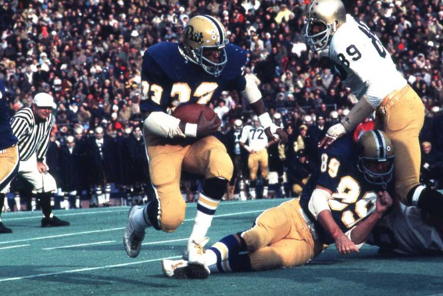
It would be deja vu for Majors in the Steel City. Pitt improved its record for four straight years, culminating in Tony Dorsett — his script helmet covered in stickers for every touchdown he scored — rushing for more than 200 yards in the Sugar Bowl. The 27-3 win over University of Georgia gave Pitt a national championship in 1976.
Before he arrived, Majors said Pitt uniforms were old gold and navy blue, a lot like University of Notre Dame’s uniforms — then and now. But they lacked a logo, and Majors said Pitt need something to catch people’s attention.
So he looked for inspiration across the country at University of California, Los Angeles, which has a “catchy script,” and called in a Pitt-employed artist.
“I said ‘I want to see what it looks like in print, I want to see what it looks like in script.’” Majors said. He also asked for versions with letters of equal heights and with capital and lower cases.
“[The artist] did about a half a dozen signs, and I picked out the one we used,” Majors said.
The result? Smoothly drawn letters, with plump tails and flowing curves, spelling out “Pitt.” This would be Pitt football’s first helmet logo.
To Paul Lukas, a uniform expert who started analyzing sports aesthetics in 1999 for The Village Voice, Pitt waited far too long to add a helmet logo.
To him, the key to every outfit is what sits on top.
“Every football uniform starts with the helmet, you have to have a good helmet,” Lukas, who also writes for ESPN and maintains his own website, said.
With the script gracing the side, Lukas said the helmet came alive.
“There’s something sort of snappy about [Pitt script],” Lukas said. “There’s a little edge of wit to it that I’ve always liked, a playfulness. Those are elements that are pretty much lacking in today’s sports graphics.”
A shift in hue complemented the new logo. Majors updated the colors to a royal blue and a bright mustard yellow from the earlier, drab palette.
Just like a uniform naturally fades with time, subsequent coaches toned down the temperature of the colors.
“[Later coaches] kept the script but they lightened the gold, and they lightened the blue,” Majors said. “I changed that when I came back the second time.”
Majors left Pitt in 1976 after winning a national championship to coach at his alma mater, University of Tennessee. He returned in 1993 for three more seasons in the blue and yellow, but left Pittsburgh for good in 1996.
The script had survived other coaching changes, but Pitt was going through more than a standard leadership swap in 1996 when Pitt hired former athletic director Steve Pederson.
As part of his new program, Pederson wanted to rebrand the team to appeal to a wider audience, according to Bonasorte, who was on Pederson’s redesign committee.
“[Pederson] wanted to blend in with the steel town image,” Bonasorte said. The new logo reflected that, and it appeared “chiseled out,” as he described.
Pederson brought in Peter Moore, the creator of the the Air Jordan logo, to design a replacement for the venerable script. The new design featured a growling panther perched on top of the familiar blocky “Pittsburgh,” arched in a half circle.
“This mark not only standardizes all Pittsburgh athletic marks, but it serves as a new image we want to emulate in everything we do — bold and dynamic,” Pederson said in the press release announcing the rebranding.
To Lukas, Moore’s logo was a step backwards.
“So much of contemporary sports graphic is about looking ferocious. Furrowed brow, gritted teeth, all that kind of crap,” Lukas said. “What made the script special was how it didn’t take itself so seriously.”
By branding the University’s athletics generically, Bonasorte said alums of other universities like Washington and Jefferson College, Thiel College, Ohio State University and Robert Morris University make Pitt their second team. By replacing the Pitt script — and all its Pitt-specific connotations — the team could market itself better to neutral fans.
“You can be a Panther fan and not hurt that you are a Robert Morris dad,” Bonasorte said.
Part of Pederson’s redesign also toned the colors down to the current navy blue and old gold, like they were before Majors came to Pitt.
And present Pitt fans have noticed how generic that logo feels.
“[Pitt script] looks so much slicker compared to the block lettering,” said Colin Gilbert, a freshman marketing and supply chain management major, as he browsed the script hats at the Pitt Stop. “It’s more tailored to Pitt itself, it’s more of a logo.”
Pitt removed the last vestiges of the script in 1996. But the fans’ love for the script never left.
Fans freaked out when Pitt announced it would place Pitt script stickers over the current block Pitt logo on the team’s helmets for last year’s homecoming.
By popular demand, the script was back. And the popularity of the vintage emblem ensured it would stick for the rest of the year.
The pressure that made Pederson — he resigned in December of last year — reconsider also hit his replacement, Scott Barnes. And Barnes didn’t bother fighting back. In August of this year, he announced that the script would be back for good, for every sport, for the 2016-17 athletic seasons.
Pitt’s first game after the announcement was the home opener against Youngstown State University. Bonasorte, selling gear outside Heinz Field for the game, had caps with both the blocky font and the script on them.
“All [the fans] wanted were the script hats, we didn’t sell any of the other ones,” Bonasorte said.
This makes sense to Lukas.
“[In general, fans] have fonder memories of an ugly uniform that the team won a championship in then rather than a nice uniform they had a losing season in,” Lukas said.
So if a team has won a championship while looking sharp, like Pitt did in 1976, you have a timeless aesthetic.
“We had some of the greatest uniforms in America,” Majors said. “Our players loved them, our fans loved them and they catch on you.”
Majors was a consummate disciplinarian — “pride and enthusiasm” doesn’t work unless you train the team hard.
“His thing was ‘whatever it takes,’” Bonasorte said of Majors’ coaching. “They dotted the i’s and crossed the t’s in 1973, where nobody in life even thought about it.”
This attention to detail won Majors, Bonasorte and all of Pitt glory in 1976.
But the spiraling i’s and t’s, along with the big P.?
They’re a timeless bonus.