

Column: A requiem for Pitt Athletics’ old online layout
Thomas Yang | Assistant Visual Editor
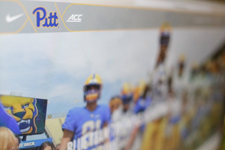
Pitt Athletic’s current website.
April 16, 2019
Pitt Athletics hosted its long-awaited reveal ceremony at Bigelow Bash on April 8, unveiling a new visual style across all its programs. The changes, displayed during a flashy fashion show in partnership with Nike’s Global Identity Group, included a throwback-inspired royal blue and yellow color scheme, an original Panther logo and new uniforms with numbers based on the Cathedral arches.
The new initiatives, billed as a “strong and unified visual identity” by Athletic Director Heather Lyke, received near-universal acclaim from students, athletes and fans alike — save for a mixed reaction on the font of the numbers, which some deemed too pointy.
Behind the scenes, though, a more subtle shift happened within Pitt Athletics. This one didn’t involve any public brouhaha, but instead happened quietly, behind closed doors. In fact, this change probably went unnoticed by most Pitt fans, except for those with a need or affinity for checking statistics and press releases.
I’m referring, of course, to Pitt Athletics’ new — but far from improved — website, which went into effect along with the reveal event on April 8.
I’m a member of the sports media, meaning I’ve seen quite a few college athletic websites in my day. They’re typically a journalist’s first resource for fact-checking player names, years, statistics and the like. Most team websites follow roughly the same formula: a task bar across the top of the screen, including an icon labeled “Sports” that provides quick and easy access to the schedule, roster and news for each of the school’s athletic programs. Some are less visually appealing than others, but most provide the same level of navigability.
Call me biased, but I always thought Pitt’s old athletic website was among the nation’s best. It was easy to look at and just as easy to use — a blend of style and practicality nearly unrivaled among its peers.
In all my experience with collegiate athletic sites, there was always one school that stood out as having a particularly dreadful layout: Syracuse. The Orange’s online home looks fine on the surface, with a scoreboard across the top and large pictures on the main page that lead to new articles. There’s just one nagging problem — it’s hard to get to your desired location, especially if it’s your first time visiting the website. This is because Syracuse’s tech team decided it was a good idea to swap out the written labels with icons, creating a sort of guessing game as to which images indicate news, schedule, roster and so forth.
I get that Syracuse is trying to be different from its peers, to zig where other sites zag, with an emphasis on succinctness and simplicity. Even its URL, cuse.com, is a bastion of brevity. But since the dawn of the Phoenician alphabet around 1000 B.C., human beings have communicated primarily through alphabetical letters. Words are effective because they have an exact meaning. So it always puzzled me as to why Syracuse Athletics chose to rely on ambiguous images to depict information. For a school that prides itself on having a top-notch communications department, the athletic site sure does a poor job of communicating.
So you can imagine my dismay when I went to check Pitt Athletic’s website on the night of April 8, only to find a labyrinthine and disorienting icon-based layout seemingly inspired by our Orange neighbors to the north. Instead of simply changing the color scheme from navy and gold to blue and yellow, Pitt Athletics decided that wasn’t enough — it needed to drastically revamp the entire user interface as well.
Gone is the easy-to-use toolbar across the top of the screen, replaced instead by only four options that can be reached with one click. All four options, “Buy Tickets,” “Shop Now,” “Donate Today” and “Online Auction,” have to do with giving money to Pitt Athletics, giving the impression that the department made the collective decision to prioritize finance over usability.
What used to take a simple, mindless mouse drag and a single click now takes three clicks and a moment of hesitation as you try to decide which icon signifies the link you’re looking for. Sure, it only takes a second or two to realize the image of a calendar probably means schedule, or the icon showing the outline of three people probably means roster. But you know how one would be able to tell for sure? If the labels simply read “Roster” or “Schedule” like the good old days.
Maybe the new website will just take some time to get used to. But I can’t see a scenario where clicking on a drop-down bar on the side of the screen, clicking “Teams” then scrolling through a vertical list of all Pitt’s athletic programs in order to reach my destination is more convenient than the old path. The only thing I can think of is that Pitt Athletics wanted to make its site more accessible to prekindergarten toddlers who haven’t learned to read yet but can still derive meaning from the iconography.
So, Pitt Athletics, you can change the color scheme I grew up watching, come up with a new logo and make the jersey numbers as pointy as you want. These new initiatives have little to no effect on my personal life. But when you mess with the user interface of your website — modeling it after one of the most confusing layouts and a long-time Pitt rival, no less — and prolong my fact-checking process by two to three seconds, then we’ve got problems, pal.
