

Opinion | It’s time to update Pittsburgh’s flag
March 15, 2021
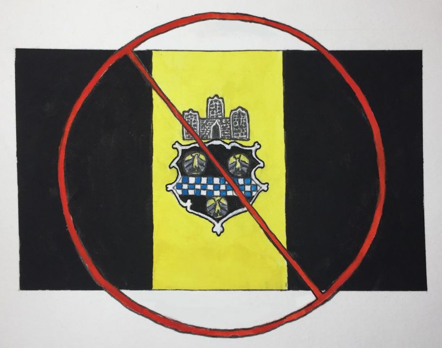
Try to picture Pittsburgh’s flag. Chances are you can’t — it might be news to you that the City even has a flag. It’s black and gold, that much I know. And there’s some sort of black shape in the middle with a little castle on top, right? At least that’s the best I can picture off the top of my head.
Pittsburgh’s flag is not alone in its lack of memorability. In fact, bland and needlessly intricate flags are endemic to American states and cities. Of the 50 state flags, the only ones I could draw with any confidence are Texas and Alabama by virtue of their simplicity. Maybe I could pull off a butchering of California’s flag and its famous grizzly bear. Drawing Pennsylvania’s flag is entirely off the table, let alone understanding what most of its design elements represent. If the average person can’t draw or discern much meaning from a flag, what good is it? Flags don’t exist for their own sake — they should be emblematic of the area they represent.
Local flags are even worse. A quick Google search brings up endless blog posts with titles like “The 11 Most Comically Ugly City Flags in the U.S.” or “Ten Worst City Flags in the United States.” If you’re struggling to grasp just how ugly some of these flags are, I’d highly recommend checking out Milwaukee’s. That city is dealing with a vexillological disaster of epic proportions.
While not quite as bad as Milwaukee’s, Pittsburgh’s flag is the furthest thing from inspiring. For all of its faults, of which there are many, I’m proud to be living in Pittsburgh, and I’m willing to bet that many others are, too. It’s time for the City’s flag to get a facelift to reflect this pride and sense of identity.
It’s not like we have teams of scientists working day and night to figure out what makes a good flag — that code has been cracked for centuries. We have our very own exemplar in the American flag. The stars represent the 50 states, and the stripes represent the original 13 colonies. While the original meaning of the red, white and blue color scheme — representing valor, purity and justice, respectively — has been lost, the simplicity of the flag has given these colors a modern day meaning of their own. There’s no mistaking that these colors represent the United States.
In contrast, Pittsburgh’s current flag is more of an homage to colonialism than a symbol of the City. The central feature is an obnoxiously detailed interpretation of the family coat of arms of William Pitt, who just so happened to be secretary of state during Britain’s capture of Fort Duquesne in 1758. It’s almost certain that Pitt never set foot in any one of the dozen or so American cities named in his honor, so why feel beholden to this design? The coat of arms needs to go, including the ugly touch of blue it brings to the black and gold color scheme.
The color scheme is perhaps the only part of the flag we shouldn’t change, even if it’s from the same coat of arms I just disparaged. The removal of the coat of arms and retainment of the black and gold sets up a pretty good criteria for what makes a worthwhile design element in a flag. If it’s symbolic, but not cherished, it needs to go. If it’s symbolic because it’s fundamentally woven in the popular culture of a place — in this case, the black and gold being a staple of our sports teams — it’s probably worth including.
The aforementioned castle, which I really anticipated finding out was Fort Duquesne or Fort Pitt as I researched, is actually just some castle. Suffice to say, this fails the symbolism test. The official explanation on the Pittsburgh City website for this element is simply that “a castle symbolizes ‘city’ in the language of heraldry.” Heraldry is the language of coats of arms — something Pittsburgh residents couldn’t possibly be expected to know. Therefore, the castle has to go.
We’re now left with a wide-open black-and-gold canvas, eagerly awaiting the great symbols of Pittsburgh. What are those great symbols? Some informal flag redesign contests have filtered rivers and bridges to the top, and I don’t disagree. The heart of Pittsburgh exists where the Monongahela and Allegheny rivers meet, so it would be perfectly appropriate to make rivers the centerpiece of a redesigned flag. Plus, rivers have a pretty good track record as focal points of City flags, being featured on the St. Louis, Cincinnati and Chicago flags — all three of which ranked higher than Pittsburgh’s on a survey conducted by the North American Vexillological Institution.
If we’re looking to break the mold a bit more, Pittsburgh could take the bridge route for a redesign. I’d argue that the most beautiful and iconic view of the City comes right between escaping traffic in the Fort Pitt Tunnel and frantically changing lanes at the end of the Fort Pitt Bridge. Perhaps a simple silhouette of the skyline and a yellow bridge could suffice as our new flag.
Ultimately, I’m no artist, but there are plenty of willing and able ones out there. Zooming back in on the Milwaukee situation, the clunky ode to clip art is currently in a state of limbo. The city’s flag has been recognized as the abomination for some time, and graphic designer Steve Kodis recently took it upon himself to launch a campaign to find its replacement. This culminated in a 2016 online vote that chose a design titled “Sunrise Over The Lake” to succeed the current one.
The city council dragged its feet, and five years later, no official changes have been made. But that’s not the lesson here. Regardless of whatever stalling and committee hot potato Milwaukee City Council has played with the design, it’s now the de facto flag of the city. There are shirts, pillows and shower curtains being sold with this new design, because citizens of Milwaukee connect with it. I even found a tattoo on the new flag’s website, a sure sign of vexillological success.
Now it’s time for Pittsburgh to do the same, hopefully with official adoption. I’d be more than willing to engage in a little capitalism in support of a modernized flag, maybe buying a mug or a shirt with the new design. Admittedly, tattoos might be a bit out of my comfort zone, but I’m certain there’s a market for it. At the moment, though, it just feels a bit silly to have pride in what amounts to an advertisement for the esteemed family of William Pitt rather than a symbol we can connect with.
Jack Troy writes primarily about politics and environmental issues. Write to him at [email protected].
